Skeletons and Loadings Have Everything to Do With Elevators and Minecraft
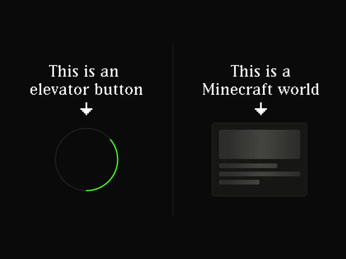
A convention that the design community adopted without ever testing it.
There’s a convention I enforce in my design system that I’m completely confident in, and completely unable to prove.
Skeleton and loading are not interchangeable. Each one communicates something different, not just visually, but semantically. When you reach for one over the other, you’re making a claim about what’s happening in that moment. And that claim should be deliberate.
I believe this is right. And yet, if you asked me to show you the research proving that users actually experience these two states differently, I couldn’t. Because it doesn’t exist, as far as I can tell. And almost no one in the design community is talking about that gap.
The distinction that makes sense, on paper
Not all waiting is the same. At least, that’s the premise.
Think about pressing an elevator button. The button lights up. You know the elevator is coming because you called it. There’s an active contract between your action and the expected result.
Now think about loading into a Minecraft world that hasn’t fully rendered yet. You didn’t trigger each block that appears on the screen. The world is materializing on its own schedule, chunk by chunk.
These feel like different experiences. That intuition is the foundation of the skeleton/loading distinction.
Loading = The system is processing an action initiated by the user. There’s agency. The user has taken an action and is waiting for a response.
Skeleton = The system is fetching content from an external source. The user arrived somewhere and is waiting for the world to appear.
The Nielsen Norman Group and others in the field have adopted this framing. The recommended decision rule is: “Is the user waiting for an action to complete, or for content to appear?” It’s clean. It’s logical. It maps well to how interfaces actually work.
But notice what it’s based on: a convention built on intuition, not on evidence of how users actually experience the wait.
Loading is a spectrum
Before going further, it’s worth acknowledging that loading itself isn’t a single state.
Spinner only = “Something is happening.” Minimum viable feedback. The system acknowledges the request. Nothing more.
Spinner + static text = “I’m processing your action.” Adds intent. Think: “Saving your changes.” “Submitting your order.” The user knows something is being processed, just not what that something is.
Spinner + dynamic text = “Here’s exactly what I’m doing right now.” The richest form. When you search for flights and see “Checking EasyJet… Searched 12 of 31 providers,” even if that sequence is scripted and always the same, it creates a sense of progress. Things are starting and finishing. The wait feels like it’s moving somewhere.
Skeleton = “The content will take this shape.” A different contract entirely. No action is being processed. A structure is being revealed.
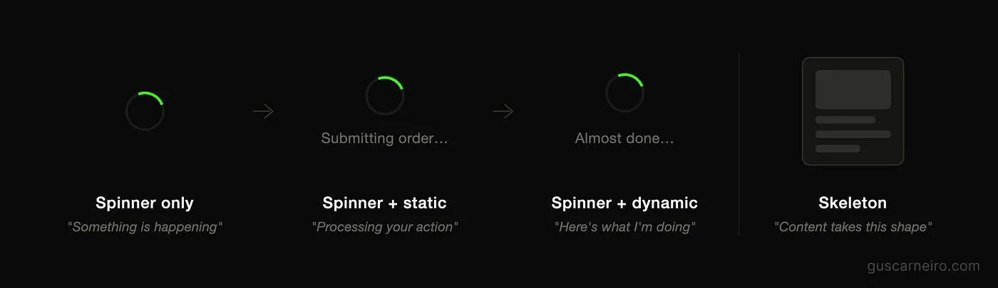
Loading is a spectrum of semantic information. Skeleton breaks the pattern entirely; it’s not a richer form of loading, it’s a different contract.
This spectrum matters because the decision isn’t just about skeleton or loading; it’s about how much semantic information you provide the user at that specific moment.
But again, that’s a design system framing, still rooted in what makes sense to us rather than in what users do differently.
What the research actually covers, and where it disagrees
There is real research on these patterns, just not the one you might expect.
The most referenced study comes from Viget in 2017.
They tested 136 users across three identical-duration loading animations: a spinner, a skeleton screen, and a blank screen. The hypothesis was that skeleton screens would feel fastest.
The result was the opposite: skeleton screens performed worst by every metric. Users in the skeleton group perceived the wait as longer, rated the experience more negatively, and took more time to complete the task.
The researchers’ best explanation was that skeleton screens, being relatively new at the time in 2017, attracted more attention and made the wait feel more conscious, while the familiar spinner faded into the background.
A study published at ECCE 2018 reached a different conclusion.
Skeleton screens scored higher on average for both perceived speed and ease of navigation. However, users who saw spinners were actually faster at completing the task. And critically, the paper itself notes that no statistically significant differences were found between the two conditions.
The two most-cited studies on this topic point in opposite directions, and neither produces a definitive result.
What both studies share, and what’s most important for this article, is what they don’t measure.
No study has asked whether users respond differently when they’re waiting for an action to resolve versus waiting for content to appear.
Neither has it been tested whether applying skeleton to a form submission, where loading would be semantically correct, breaks expectations, affects how the user feels, or changes their behavior.
That question, as far as the published literature goes, is completely unanswered. And unlike the perceived-speed question, it hasn’t even been seriously attempted.
Why the distinction still makes sense, just not for the reason we usually say
Honestly, here’s where I land after sitting with this.
The strongest argument for the skeleton/loading distinction isn’t the user experience. It’s the system experience.
When I was building a multi-brand design system, I had to decide: are these variants of the same component, or separate components entirely?
By convention, skeleton signals that content is being fetched from an external source. Loading signals that the user triggered an action and is waiting for a response. The distinction is intentional, even if unproven. A system that treats these as interchangeable leaves the decision of which to use open, and open decisions get made inconsistently.
That inconsistency doesn’t announce itself. It accumulates silently, one screen at a time, as different designers make different calls in the same product. The result isn’t a catastrophic UX failure, it’s a system that gradually stops meaning anything, because no one enforced what each pattern was supposed to say.
There’s a related argument worth making about skeleton as a standalone component rather than a state of a complex component, and why collapsing it into a state creates prop inheritance problems that don’t exist when it stands alone. But that’s a separate article.
So yes, I enforce the distinction. Not because I can prove users experience these states differently. But because it keeps the system consistent, it encodes a decision that should be made once, not repeatedly.
The gap is worth acknowledging
The design community has largely adopted the skeleton/loading distinction as settled practice. YouTube uses skeleton. LinkedIn uses it too. The pattern appears in Material Design, in Apple’s HIG, in virtually every major design system in the field.
What hasn’t happened, at least not publicly, is someone testing whether applying these patterns correctly versus incorrectly produces a measurable difference in user behavior. Does using skeleton on a form submission cause users to hesitate? Do they lose trust? Do they misread a loading state and refresh prematurely?
We don’t know. And given that the research on the simpler question (does a skeleton feel faster than a spinner?) can’t even reach a consistent answer, the more nuanced semantic question feels even further from being resolved.
Until then, the distinction is a well-reasoned convention. Backed by logic, adopted by the industry, and useful for keeping design systems coherent. But it has not been proven on the axis that matters most: how real users experience the wait.
A practical rule, with the right confidence level
When deciding which pattern to use:
Was this triggered by the user, or by the system fetching external data on its own?
User-triggered = Loading. Match the detail level to the expected duration. Short action? A spinner is enough. Long, multi-step process? Dynamic text earns trust.
System-fetching = Skeleton. Make sure the placeholder structure actually reflects what’s coming, an inaccurate skeleton breaks the only promise it makes.
Apply this rule not because it’s proven to move a metric, but because it makes your system internally consistent. And because consistency, over time, builds the kind of trust that’s very hard to measure and very easy to lose.
The honest version
I’m confident the skeleton/loading semantic distinction is worth enforcing. I’m not confident it matters to users in ways we can currently measure.
Both of those things can be true. A principle can be logically sound and empirically unverified at the same time. Much of what we call design best practice lives in that space, reasonable conventions built on intuition, experience, and partial evidence, waiting for someone to actually test them properly.
This one is waiting.
Written while building a multi-brand design system. The convention is enforced. The proof is still pending.
Originally published on medium.com.